The Good, the bad and the ugly...
Monogramming to Your Best Ability
 | ||||
| Stunning Example of High Quality Embroidery Work |
Today's blog will focus on the importance of a well made monogram design and hopefully clear up some misconceptions about monogramming. The items I chose to highlight all have one common denominator...a good clean photograph. Some are great shots of embroidery well done...and some are just not that great. Let me show you what happened in each example so you can create beautiful embroidery always.
Let me preface this article by saying it is not my intent to hurt feelings, cause dissent or otherwise embarrass. My intent is to educate.
This first sample I call 'well I want it thick'. I am sure if you monogram for others you hear this quite frequently as no one wants a thin washed out monogram on their item...who can blame them? What I repeatedly see happening is that the monogrammer will go into their software and increase the boldness of the font with no regard to stitch quality, see below.
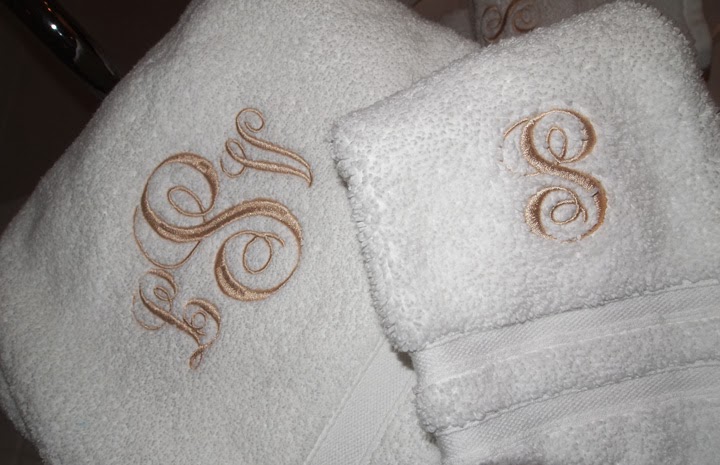
Several sections of the 'S' on the left hand towel show partial fill stitch and partial satin stitch. What has happened is that the designer tried to take this font to a level that it wasn't created for. It is a beautiful font but I am unsure of the source of this particular font, there are a lot of 'fakes' out there on the internet and this may be one of those $1 fonts. Good quality fonts costs more than one dollar ladies, sorry but they do.
Monogram Wizard Plus has a similar font and it has a threshold minimum and maximum (which is a good thing). In layman's terms that means if the designer enlarges the font past a certain threshold the font will automatically convert to a 'filled satin stitch'- which is the correct procedure.
One of two things happened with this design.
- The font was purchased from a source that didn't correctly digitize it for use on napped fabrics (towels)
- The end user decided to bypass their software controls of a maximum satin width of 3/8.
Here is an example of a soft ware attempting to correct what the designer is wanting.
 | ||
| Notice at the widest point of the 's' the design stitching looks more tightly packed, this is because we are very near the maximum width of a proper satin stitch. |
 | |||||
| Now several sections of the design are a fill stitch and several are a satin stitch. This is not what quality looks like but it isn't the fault of the software, but the end user. If I bring down the boldness and letter width a bit, and decrease the size of my letters I can have the complete design become a good quality satin stitch. |
 | |||
| Here the design is corrected and ready to stitch...but wait...has the textile been considered? |
Here is where most monogrammers make their biggest mistake. This particular font is very pretty but it does have very narrow elements. This font would stitch nicely on a linen towel, a quick dry low loft towel from Pure Fiber but this font will not stitch well on a HIGH LOFT TOWEL, no matter how much water soluble stabilizer you add to this design you cannot make the narrow points not 'fall into' the nap of the towel and disappear. You could use all layers of the software and increase the width of the two outer two letters and decrease the width of the center letter to get acceptable results but it is YOUR RESPONSIBILITY to educate your client regarding acceptable fonts for the textiles they have provided.
If you provide the textiles then it is still your responsibility to understand which fonts and lettering work best with which types of fibers. If it was as easy as opening a software screen and throwing some letters on a towel than everyone would be doing it.
To successfully monogram you have to know acceptable stitch widths, satin fills, column fills and other neat things. These are things your client does not dictate. You dictate what is appropriate. Otherwise you will be creating all willy-nilly and your product will not look beautiful and when the client really needs a great design they will look elsewhere. If this is your industry then educate yourself, please.
Here is a great example of master control of satin width.
 | ||||
| Notice the narrow points slide into a wide three point satin, effortlessly. This is a great example of using both elements to create a beautiful monogram, this designer used both elements and the effect is very pleasing. |
 | |
| Here is a mixed satin and fill design done beautifully. The satin stitch is in the area where it is called for as a narrow fill stitch is inappropriate. The filled satin stitches are in the areas where it is too wide for a narrow satin but it is balanced and clean, not random. This is a nice design. |
And here is an example of someone deciding not to do anything at all but convert the whole design to a 'filled satin'...wrong wrong wrong.
 | |||
| See the towel fabric 'rippling' under all those stitches? This was an epic fail all around! I assume the client wanted a giant monogram so the designer just whipped this right up, not bothering to determine whether or not the towel was made for a filled satin. Lesson here is that you cannot just put a filled satin wherever you like. |
Now here is a creative way to get around the 'satin/fill dilemma. This designer had a narrow font and scroll but really wanted it to stand out on the towel. The solution was to increase the height not the width of the scroll and add a frame for the font.
 | |||
| Clean stitching and properly used fill makes this design a winner, this job was well done and the designer has a firm grasp on what designs work on napped fabrics. |
Now let's discuss the problematic "I want to make it super big and will do so at all cost".
I know where that thought process comes from. You're thinking, "I bought this expensive machine and this software and all these designs, and thread, and bobbins and stabilizers and I will embroider it as big as I like".
Uh...no, not if you want it to look good. Look at this picture of 'go big or go home'.
 | ||
| I understand the theory just not the execution. This particular font tends to be a bit narrow so this designer decided to just get rowdy and go so big that the stitching looks horrendous. (if this is your design I am sorry, I needed it for teaching purposes, I hope your feelings are not hurt). |
I truly understand the want for large designs, but I also recognize that it is not always appropriate. If you do not educate your client then who will? To build a good company and to develop a reputation for quality work you must always insist on the best from yourself and your equipment. Just because you can make your machine do what's been done with that letter 'P' doesn't mean you should.
Below is an example of beautiful placement, execution and design. The font was properly created and professionally produced. This is excellence and definitely something to strive for.
 |
| Beautiful, an heirloom forever. |
Below is an example of a beautiful set of monogrammed towels from a professional embroidery studio. Notice the proper sizing? Notice it isn't billboard sized and notice the satin widths and placement. This is what a nice monogram job looks like.
 |
| The satin stitch widths are perfect and each design is sized appropriately for bath and hand towels as is the custom. The client did not choose the size, the monogrammer did. |
I know we discussed proper use of satin and fill stitches on designs and learning to dictate what is appropriate to your client but I couldn't resist showing this last photo. It isn't a towel but I want you to notice that the monogrammer completely ignored the stitching lines on this purse and just stuck the monogram right in the middle of it.
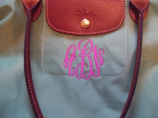 |
| This is an example of not thinking and measuring before you stitch. This monogram could have been smaller and placed 'inside' the window where the decorative stitching was, thereby creating a frame. Instead the designer just 'went with it' and now this poor monogram looks so out of place. By decreasing the size of the monogram and encouraging the client to match the monogram to the color of the leather flap there would have been a much better result. |
I have shown some examples of some beautiful monograms and some that could have used more preparation. What I hope you gained was a knowledge base that helps you consider your item 'prior to embroidery'. I also hope this gives you the courage to not let your client dictate what is acceptable and of good quality, you can provide your customer with beautiful product as long as you are in control of the outcome and are aware of how to avoid the mistakes above.
Happy Monogramming
Nicci Brazzell
MaEd, M.F.A
Thank you! Excellent.
ReplyDelete